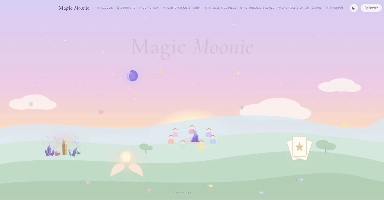
Magic Moonie
WebA showcase site where the sky and the ground are the menu.
Sasha Lacroix practises Reiki and cartomancy, and runs women's circles in the Alentejo. Her work travelled by word of mouth and on Instagram: no place of her own, nothing explaining what actually happens during a session. In this trade the first objection is never the price, it's the fear of landing on a charlatan.
A practitioner with no place of her own to show her world, explain each offering, and take booking requests anywhere other than in private messages.
An immersive showcase site: a landscape between sky and ground acting as the menu, a tarot deck you swipe to discover each offering, one page per practice, and a short booking form.
The practitioner has a place of her own: every session has its page and its explanation, and booking requests arrive through a form instead of a private message.
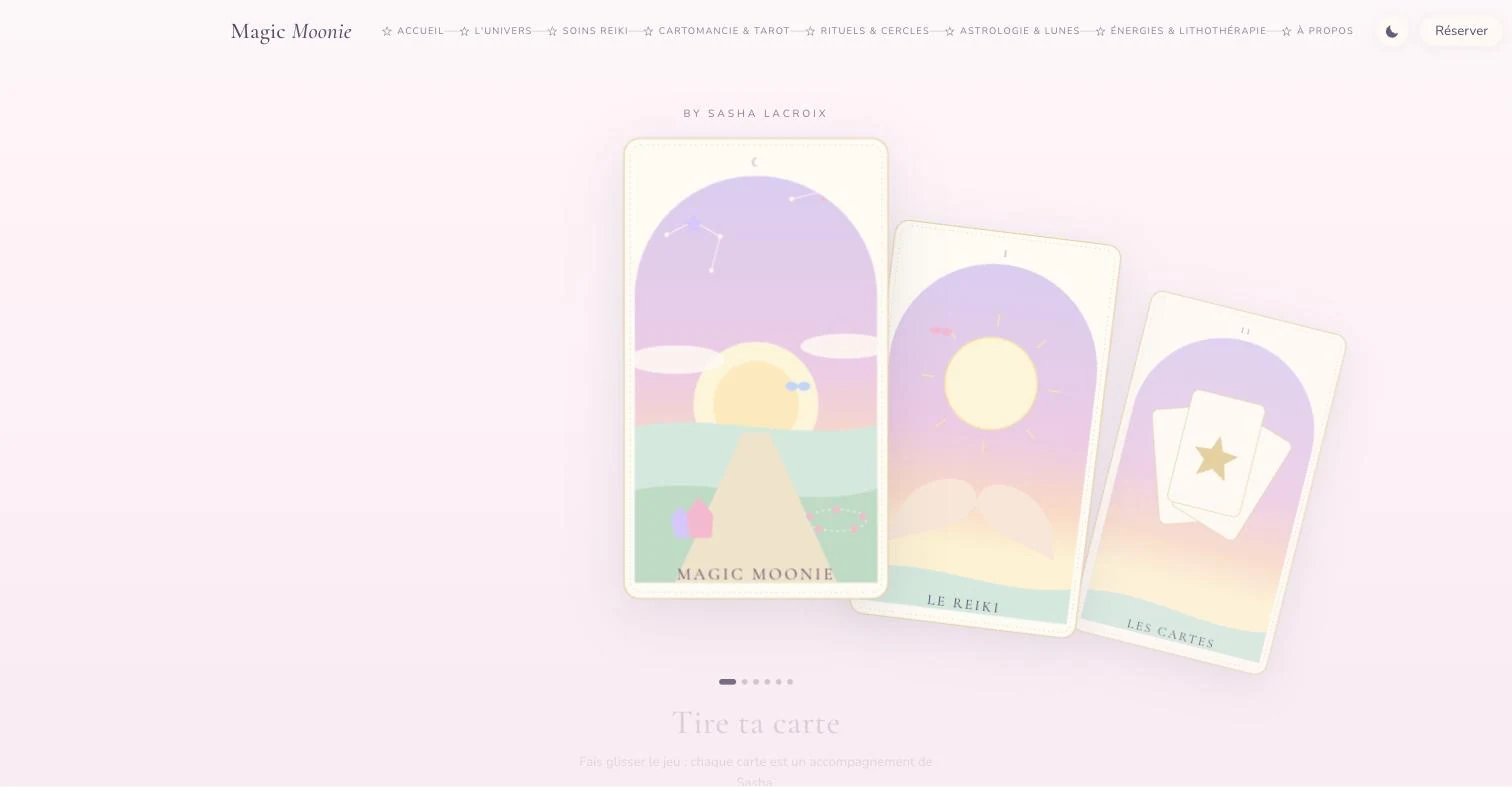
The tarot deck as the opening: one card per offering, dragged horizontally. No banner, no bold promise: an image and a gesture.
Screenshots of the production site, taken as is. Prices and lead times shown are the site's at capture time.
Do the opposite of the sector
Spiritual work online is almost always deep purple, halos and particles. The art direction went the other way: pale pastels, round shapes, butterflies, and not a single black. You recognise the site before you've read the name.
A menu you read with your eyes
The universe page is a landscape: constellations in the sky for what is symbolic, scenes set on the ground for the concrete treatments. Every element is a link. Navigating becomes a walk, not a list.
One card per offering
On the home page, a tarot deck you drag horizontally: one card, one treatment. The gesture is the one you'd use for a reading, and it works with a finger as well as a mouse.
The sky is computed, not typed
Today's moon phase and the next full moon are computed at render time, not typed in by hand. A practitioner's site announcing a moon that has already passed loses exactly what it's trying to earn.
Mobile first, properly
Two visitors out of three arrive from a phone. The landscape, the deck and the form were drawn for the thumb first, the wide screen second.
A night mode that stays the same world
The same landscape at dusk: the constellations light up, the colours go to sleep. It isn't a dark theme bolted on top, it's the same scenery at another hour.
- 01No black anywhere in the palette. The ink is a muted violet: on pastels, a true black punches a hole in the page.
- 02The background is a three-stop gradient, lilac then pink then peach, falling onto green hills. It runs from header to footer: the whole site is a sunrise.
- 03A display serif for headings, a rounded sans for body text. The contrast between the two is the site's only typographic decoration.
- 04Cards, crystals, women's circle and butterflies are drawn as vectors in the code, not imported as images. That's what lets them change colour when day turns to night.
Something similar in mind?
Describe your situation. I'll tell you what's realistic,
in what order, and what I'd do differently.